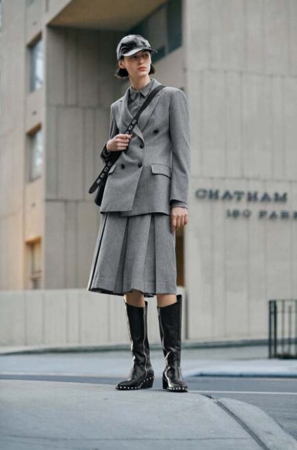
So we showed you some of our picks for the black and white campaigns forging into 2013. Well, we were left with a bit of a quandary as to how to carry on with the colored ones. There would seem to be a prominent trend of muted tones, desaturated coloring effects and well to say it simply..flat pastels? Yep. Even the skin tones seem to be a bit pastel-ish. So here are some of the muted, then I suppose we’ll work our way towards the real color campaigns which you can be certain are probably lead up by the dynamic color slickness of M&M. If you don’t know who M&M are you’re just going to have to check in on Tuesday morning to find out. Cheers! Here ya go..let’s start with Mulberry shot by Tim Walker. And i have to say, I’m sort of happy to see this face that was popular back in the 90s. We use to call it a Ford face. Now we call her Meghan Collison.


Next up a Pierre Balmain who did both b/w and muted color tones shot by Karim Sadli and I think she is just lovely.


How about some Ferragamo? Anyone who knows me knows I’m not a huge Zimmerman fan. I never really quite got her. David Sims I get though. Love.

Ok, so this Valentino I find truly gorgeous! I like the simplicity of Sarah Moon’s photographs.


Max Mara Studio by Giampaolo Sgura. I would be interested to see these pieces in person.


Again, Sims nails it. And well, who doesn’t love some Christy Turlington?

The almost identical looking yet not even related Nadja and Zuzanna.


I love love love this campaign. Although it does have a hint of color it’s muted tones are more of a fantasy of days gone by. I think Peter Lindbergh captures the essence of this so perfectly.
Now of course I could go on and on with 2013 campaigns with this discoloration pattern. But to be honest, I think there’s enough beige and vanilla in this world all ready.